以空间作为载体,打破固有对女装店铺的印象,创造艺术、生活与销售平衡的时尚文化集合地。
设计抓住品牌名字的含义,“不止”于边界所限制、“不止”于被选择所限制。
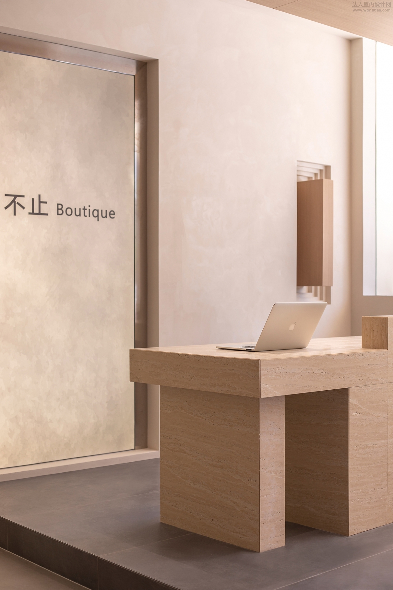
尽管在CBD的沿街黄金位置,但入口并未选择单刀直入的关系依附,以更具品牌符号化的造型引入,在顺应商业更新趋势的同时,去探寻品牌独有的的审美与时尚理念。
Although located in the golden position along the street in CBD, the entrance did not choose a direct relationship attachment, but instead introduced a more symbolic design of the brand. While following the trend of commercial updates, it explored the brand's unique aesthetic and fashion concepts.
将原外部隔断拆除,做透景玻璃橱窗,通过立面材质穿插,让户外与内部空间形成一体,模糊边界,有意引导行人进入到营造的场景中,衍生出踏进门店的仪式感......
Dismantle the original external partition and create a transparent glass display window. Through the use of facade materials, the outdoor and internal spaces are integrated, blurring the boundaries and intentionally guiding pedestrians into the created scene, resulting in a sense of ritual when entering the storee......
智能可控光的造型背景,平衡了整体的色感,以亲和且不失态度的姿态,完成空间初印象的塑造;层层叠进的地台,提升空间的层次与趣味。
The design background of intelligent controllable light balances the overall color sense, and completes the shaping of the initial impression of the space with an approachable and graceful attitude; The stacked platforms enhance the level and fun of the space.
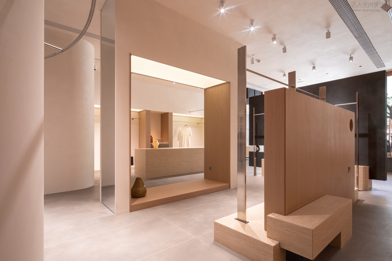
我们试图用空间的语言呈现面料造型多变之感,可轻薄似纱,也可挺括利落,既有柔软的布料线条感,又能赋予空间张力的变化。
We attempt to use the language of space to present a sense of variability in fabric design, which can be as light and thin as yarn, or as neat and neat as possible, with both a soft texture and a sense of tension in the space.


展示区域用可控灯膜的形式让光线均匀分布在空间中,营造安静、平和的购物氛围。
The display area uses a controllable light film to evenly distribute light in the space, creating a quiet and peaceful shopping atmosphere.

金属定制打造功能体系,通过交错与叠加,形成不同的陈列属性平立面,用梁柱顶面切割区域和柔化光线,表达空间的舒缓情绪。
Metal customization creates a functional system that forms different display attributes through interlocking and overlapping, using the top surface of beams and columns to cut areas and soften light, expressing the soothing emotions of the space.
硬朗与温和,理性与感性,逻辑的完美和粗粝的生命感,不同元素的对话、融合,让空间在极简外表下,展现丰富的质感和细腻的层次。
Tough and gentle, rational and emotional, logical perfection and rough sense of life, dialogue and fusion of different elements, make the space display rich texture and delicate layers under the minimalist appearance.
设计中于秩序中构建空间系统,兼具美观性与功能性的同时,在视觉铺陈上采用了圆的元素。平面构图转至立体空间时,变得极具“律动感”。
In the design, a spatial system is constructed in order, which combines aesthetics and functionality, while also incorporating circular elements in the visual layout. When the planar composition shifts to a three-dimensional space, it becomes highly rhythmic.
|  /1
/1 