设计机构|Design Agency:简狄设计事务所
本案位于上海松江区,是一套一复二带地下室的叠加别墅。屋主是位气质颇佳的美女服装设计师,对居家设计很有自己不拘一格的想法,她和先生都比较喜欢黑白灰的现代轻工业风格。因此我们在前期规划时,充分考虑到屋主的个性化需求,取消一楼原有的卧室,改造成半开放功能区,兼容居家活动和偶尔睡眠的两大功能,实现了空间互通及多元化叠加。巧妙合并原有厨房和洗手间区域,简化洗手间功能,以满足大厨房的需求。二楼客卫则利用对楼梯结构的调整,实现主人对双台盆的要求,以满足三代人同时使用。我们通过一系列格局改造,规避原房型的劣势,达到优化空间,提高使用率的目的。
摈弃传统呆板形式的客厅,依照屋主的生活习惯,用一推到底的黑框折叠门,分离出办公/阅读区和休闲客餐厅区。做旧的棕色人字拼地板,中和了干练的黑白灰调。家具呈现出20世纪包豪斯风格,复古中不乏绅士的时髦调性。 Abandon the traditional rigid living room, According to the living habits of the owner, Fold the door with a black frame pushed to the bottom, Separate the office / reading area and leisure restaurant area. Old brown fishbone tiled floor, Neutralized the capable tones of black, white and gray. The furniture presents the Bauhaus style of the 20th century, There is no lack of gentlemanly fashion in retro.
客餐厅区域非常方正,得益于设计师完美整合并隐藏了洗手间。客厅区域更象是一处休闲角,任意摆放的双人沙发、小茶几和钢琴,收拾得轻松惬意。没有花哨的背景造型,水泥灰的艺术漆大块面的涂刷出自然质朴的肌理,却适合搭配任意亮色的软装。橙黄色的中古风格的木质高脚酒柜,搭配丹麦GUBI白色吊灯,打破了餐厅的黑色基调,为餐厅带来一抹浓郁的艺术气息。 The guest dining area is very square, thanks to the designer's perfect integration and hiding of the bathroom. The living room area is more like a leisure corner. The double sofa, small tea table and Piano placed arbitrarily are easy and comfortable. There is no fancy background modeling. The large surface of cement gray art paint is painted with natural and simple texture, but it is suitable for soft clothes with any bright color. The orange medieval style wooden high foot wine cabinet, combined with the Danish Gubi white chandelier, breaks the black tone of the restaurant and brings a strong artistic flavor to the restaurant.
U型布局的厨房空间非常宽敞,冰箱、电器柜一应俱全,烹饪的功能性得到完全的满足。在延续全屋黑白灰色调的基础上,选用带有金属质感的柜门,以及水泥色地砖,让厨房的整体感觉更为硬核。 The U-shaped kitchen space is very spacious, with refrigerators and electrical cabinets, and the functionality of cooking is fully satisfied. On the basis of continuing the black-and-white and gray tone of the whole house, the cabinet door with metal texture and cement floor tiles are selected to make the overall feeling of the kitchen more hard core.
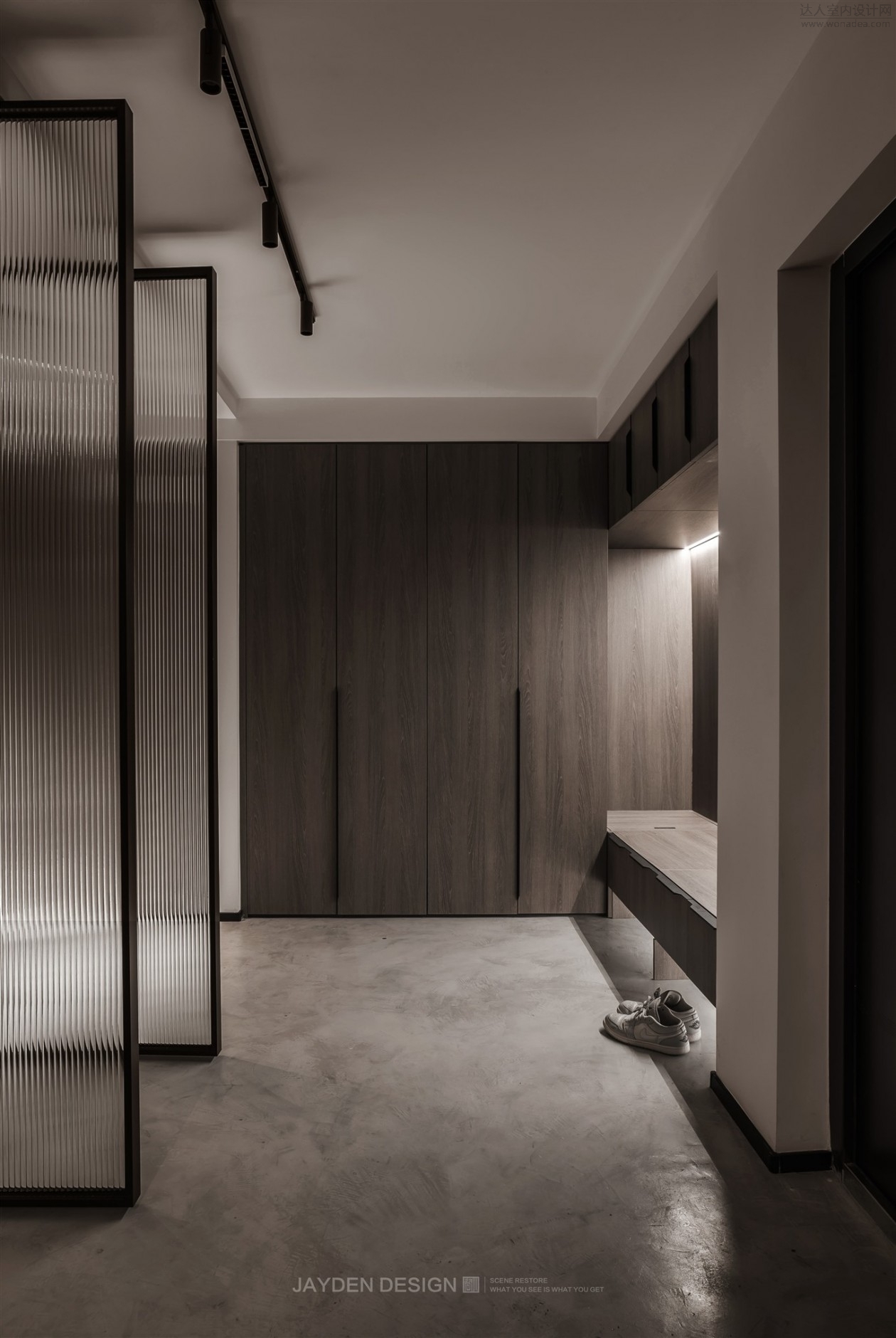
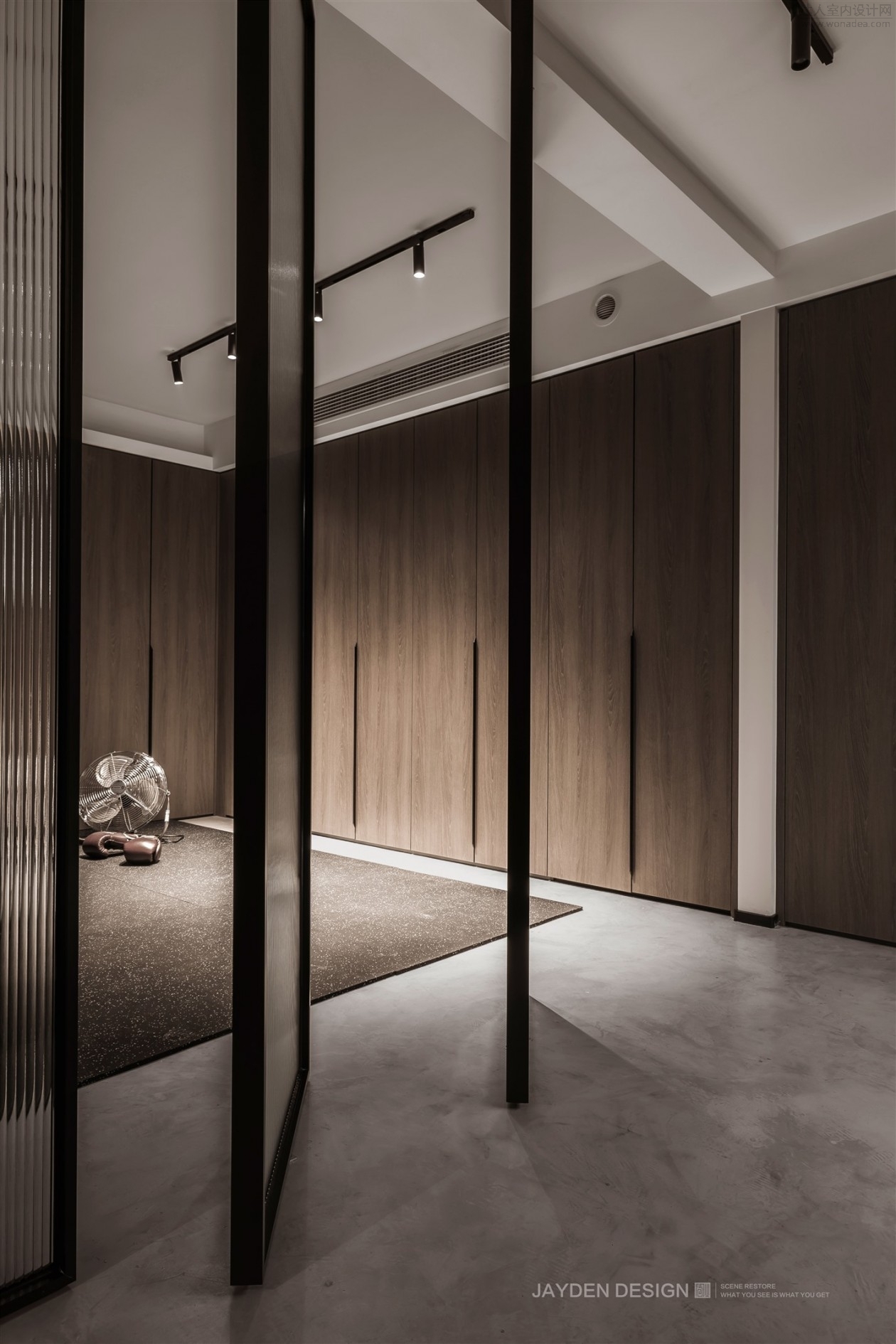
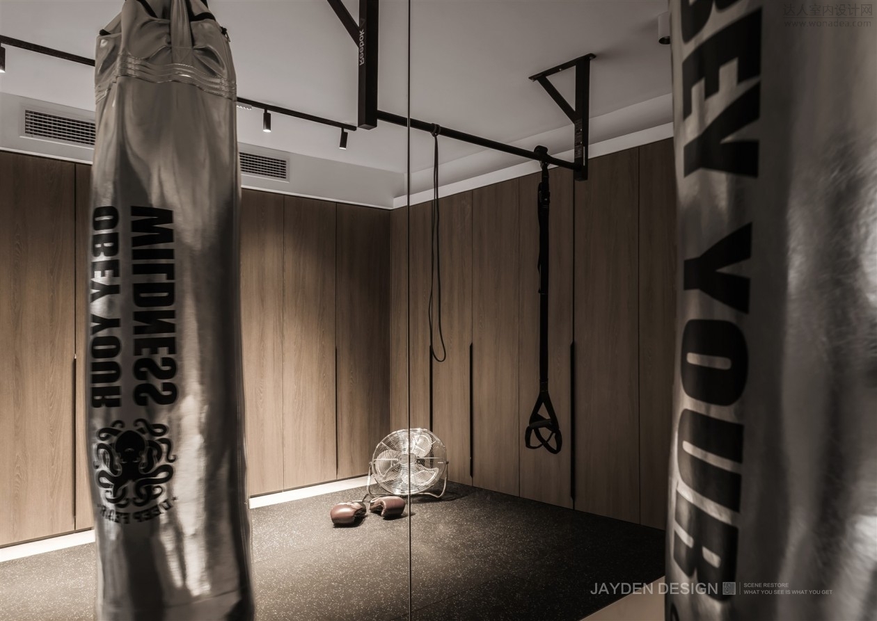
B2层为主入户,除了常规的入户鞋柜和收纳空间,这里主要规划为男主人的私人健身房。水泥自流平地面、明装轨道灯、天地轴旋转玻璃门……这些工业元素,混合着充满荷尔蒙的沙袋,俨然就是一间专业的私人健身会所。
The B2 floor is mainly for entrance. In addition to the conventional entrance shoe cabinet and storage space, it is mainly planned to be a private gym for male owners. Cement self leveling floor, surface mounted track lights, heaven and earth axis rotating glass door... These industrial elements, mixed with hormone filled sandbags, are like a professional private fitness club.
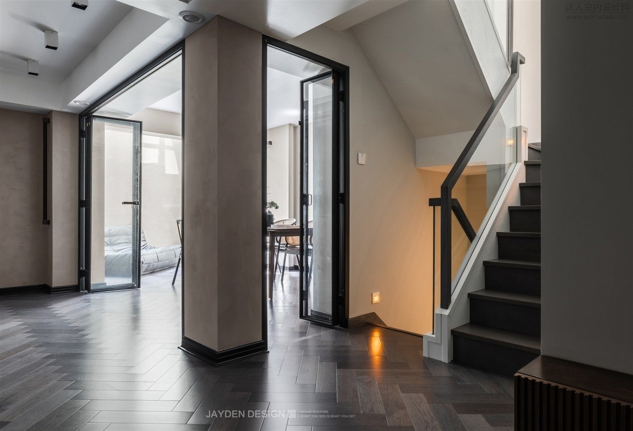
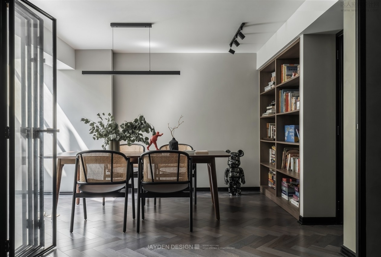
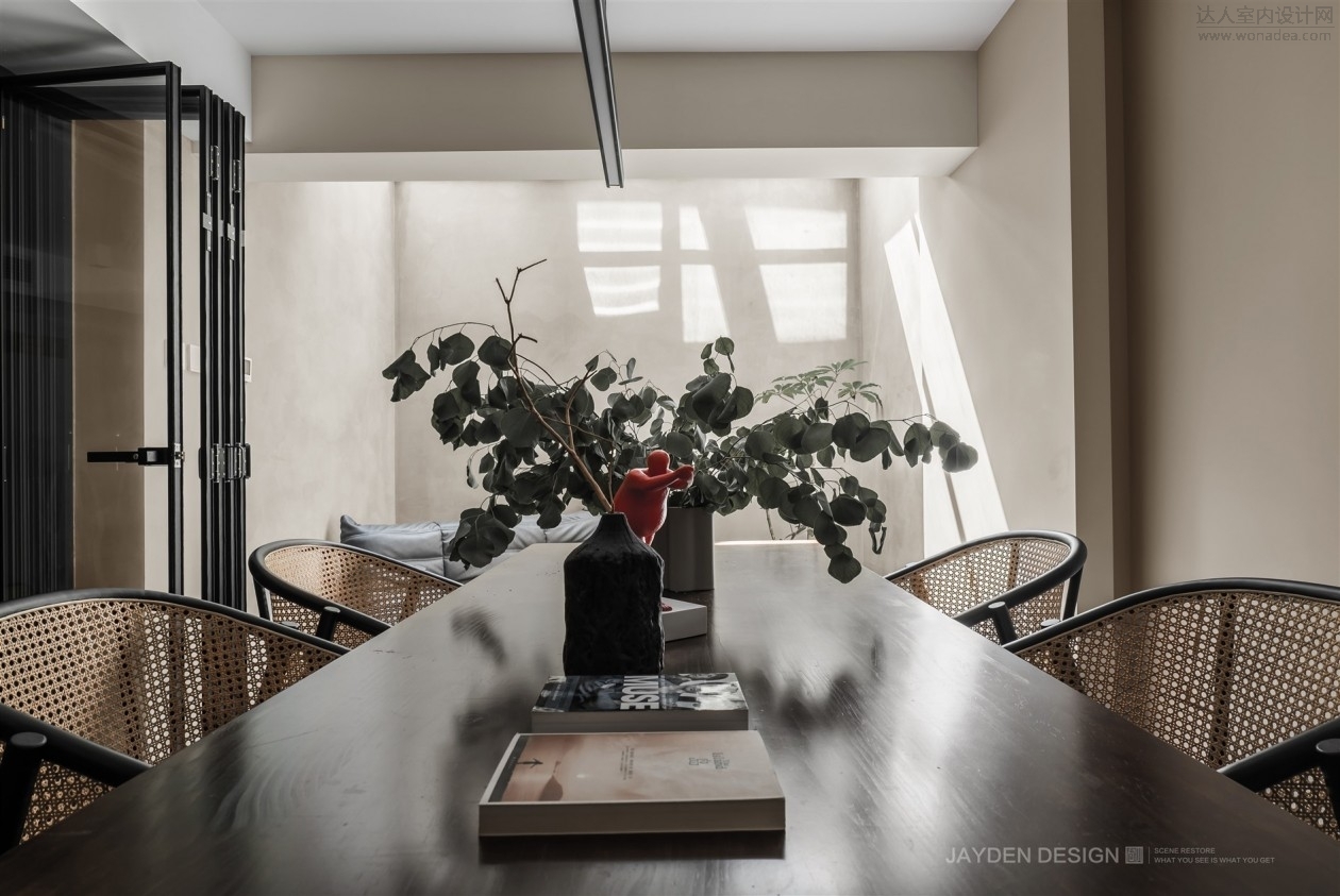
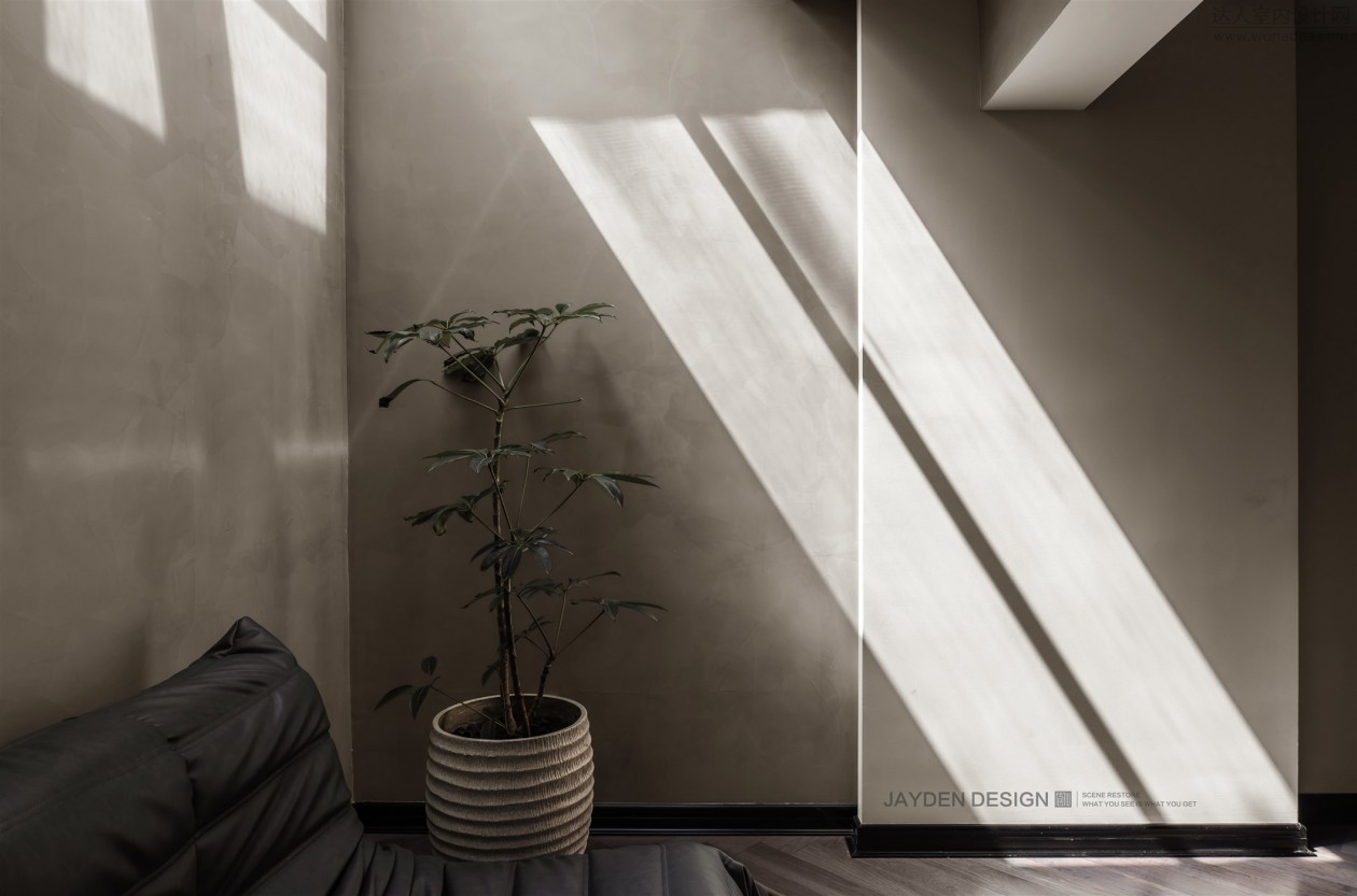
B1层为家庭休闲娱乐的主场。采光最佳的区域设计了一间开放式的工作间兼茶室,也可以做小会议室使用。采光稍次的区域规划为开放式家庭影音区和儿童游乐区,休闲沙发、小酒吧台,营造出温馨欢乐的家庭氛围,也是全屋最具温度的地方。
B1 floor is the home of family leisure and entertainment. In the area with the best lighting, an open workshop and tea room is designed, which can also be used as a small meeting room. The areas with less lighting are planned as open family audio-visual area and children's amusement area, leisure sofa and small bar, creating a warm and happy family atmosphere and the most warm place in the whole house.
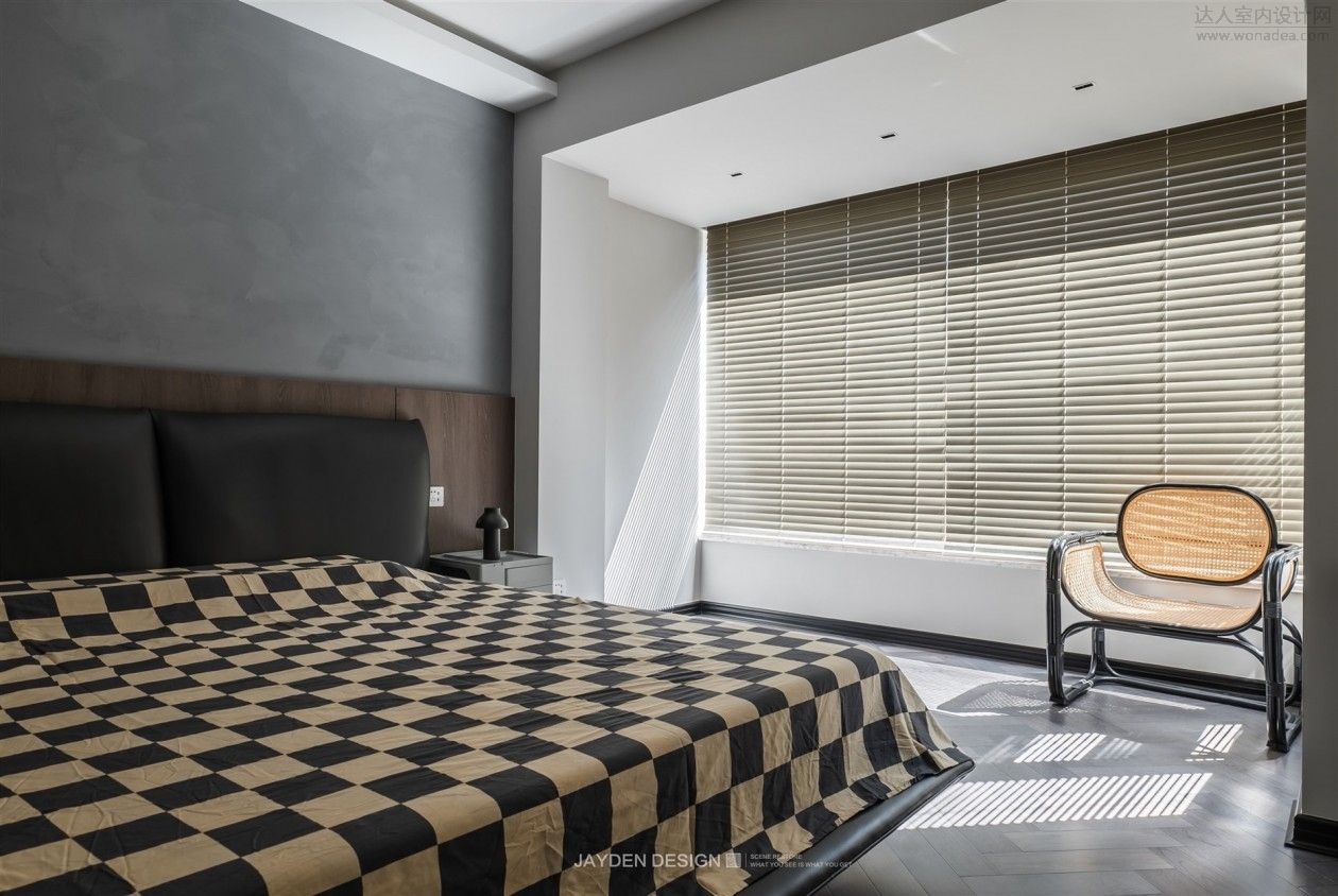
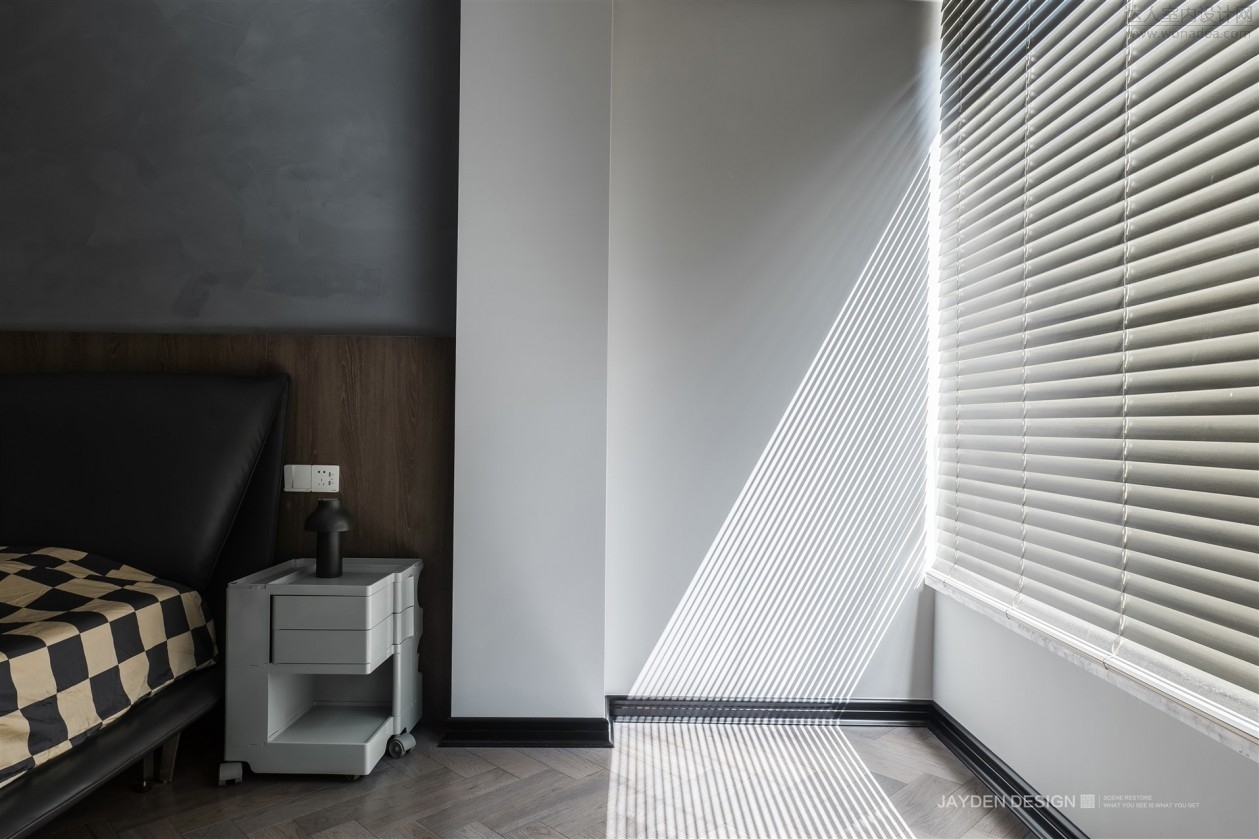
我们拆除了内阳台的移门,将阳台纳入主卧空间后,整体面积增加了三分之一。整面的落地窗让卧室的采光有了更大的提升。卧室的设计力求更贴近睡眠的主旨,以更为简洁的手法,营造出清而静的氛围。床头背景的胡桃木饰面,中和了水泥灰带来的生硬和冷峻感。 After we removed the sliding door of the inner balcony and incorporated the balcony into the master bedroom space, the overall area increased by one third. The whole floor to ceiling window has greatly improved the lighting of the bedroom. The design of the bedroom strives to be closer to the theme of sleep and create a clear and quiet atmosphere with a more concise approach. The walnut veneer on the bedside background neutralizes the stiffness and coldness brought by cement ash.
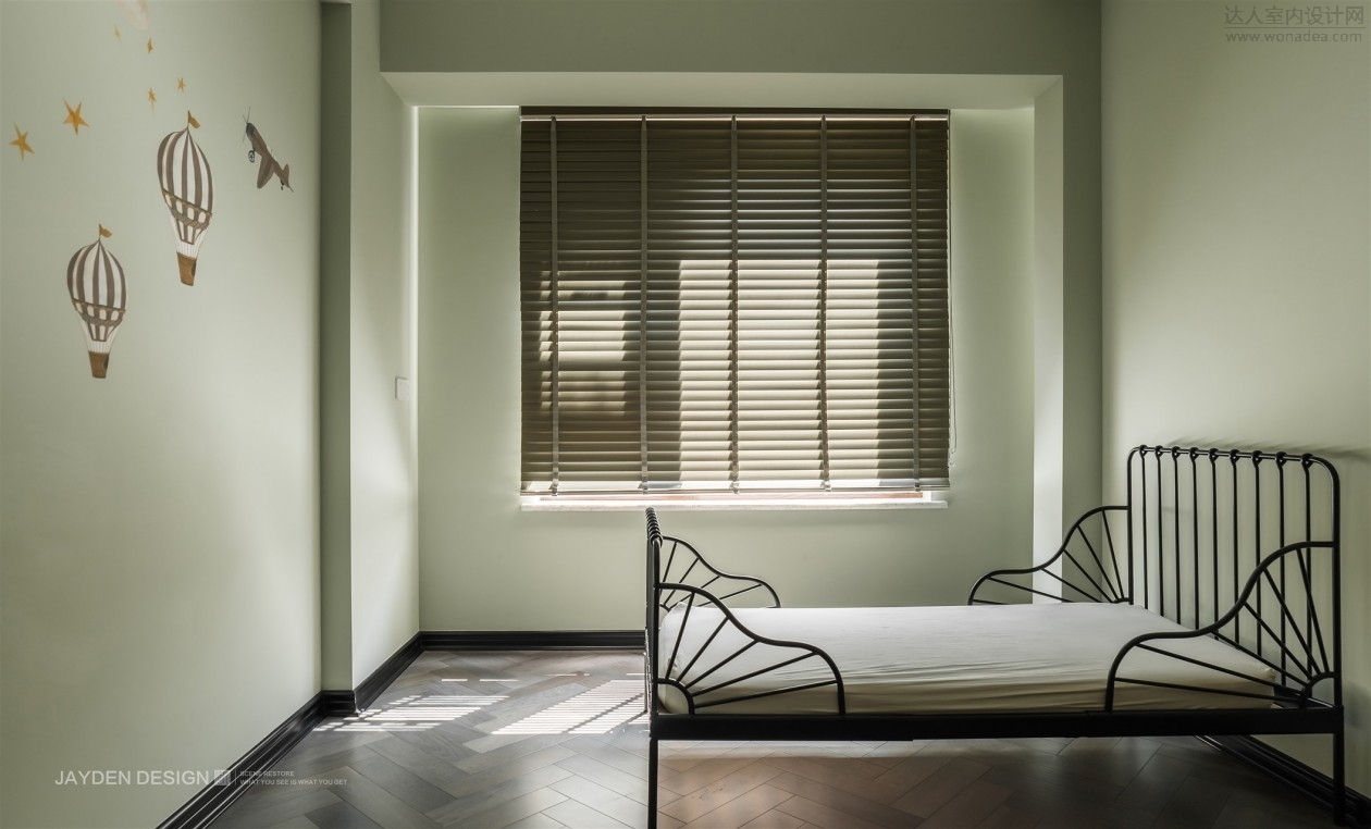
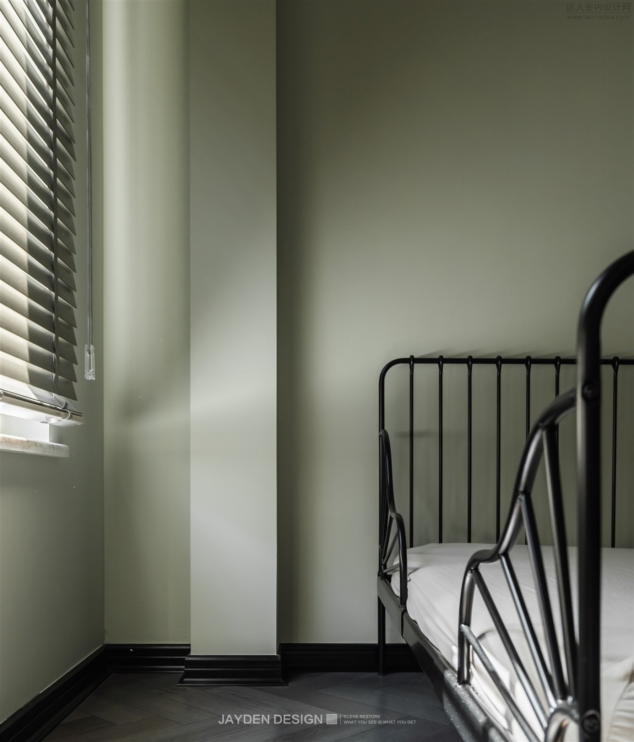
清甜的浅果绿色,活泼而不浓艳,很适合儿童房。黑色的铁艺床和活动衣柜,让空间具有更多可变性。 Sweet light fruit green, lively but not colorful, very suitable for children's room. The black iron bed and movable wardrobe make the space} more changeable.
|  /1
/1 