艺术是美的内核,是空间浓缩的本质,任其自然发酵产生新的秩序,收获意想不到的美。
地址/茂华熙府 Address/maohuaxifu 项目面积:150m² Project area/ 150m²
"
LIVING ROOM 客 厅 -

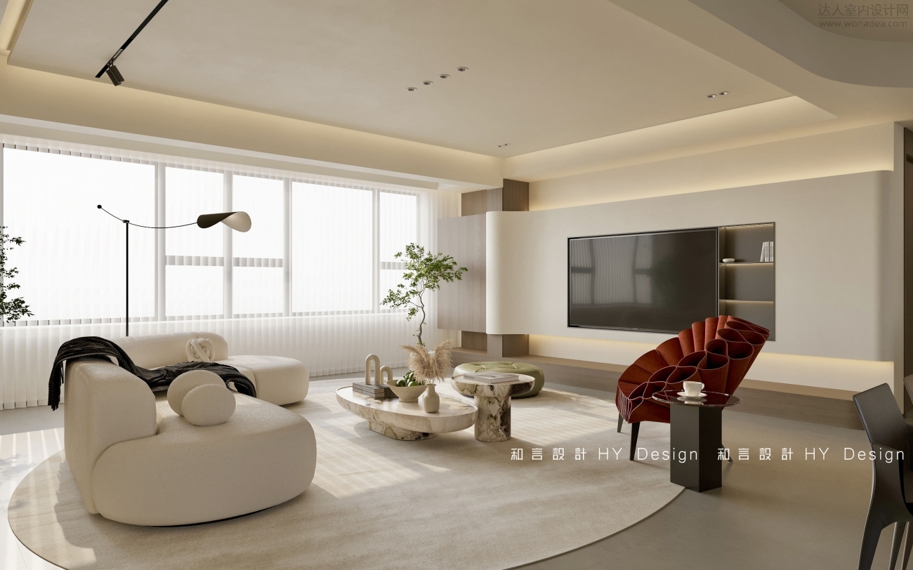
恬静的低饱和度温柔包裹,以独具温度、态度和灵魂的姿态,融入空间之中。温润空间选用柔和的奶油白与米色作为主基调,糅合有韵味的家具与配色,实现温暖而带有自愈力量的居所。
The quiet low saturation gently wrapped, with a unique temperature, attitude and soul attitude, into the space. Soft cream white and beige colors are used as the main tone of the warm space, combining charm furniture and color matching to achieve a warm and self-healing residence.

无主灯+悬浮吊顶的设计简约高级,弧形悬浮电视墙视觉上更加柔和。瓷砖通铺为家居带来无限的开阔感和视觉延展性,阳台做高柜与电视融为一体,木色高柜的加入让整体空间更典雅。
No main light + suspended ceiling design is simple and advanced, curved suspended TV wall is more soft visually. The tile floor brings infinite sense of openness and visual malleability to the home. The balcony is made of high cabinet and the TV is integrated. The addition of wooden high cabinet makes the overall space more elegant.
沙发后做整面收纳柜,一门到顶的免拉手柜门搭配黑色大理石花纹开放格,圆弧形的设计与拱形门洞形成对比,温柔和谐。柜子与隐形门一体,整体空间更加统一。
After the sofa to do the whole face of the storage cabinet, a door to the top of the no-handle cabinet door with black marble pattern open lattice, circular design and arched door to form a contrast, gentle and harmonious. The cabinet is integrated with the invisible door, and the overall space is more unified.
RESTAURANT 餐厅
-
在安静的空间之中,用线条来精准分割出比例层次;将原本餐厅空间划出多一间卧室,将空间规划更加合理。卧室门选择吊柜幽灵门视觉上更加轻盈。
In the quiet space, lines are used to accurately divide the scale level; The original dining room space is divided into one more bedroom to make the space planning more reasonable. Bedroom door choose hanging cabinet ghost door visually more light.
餐厅顶部做弧度造型,将顶面进行一定程度的弱化处理,视觉上更柔和。选择岛台更加实用高级。
The top of the restaurant is curved, the top surface is weakened to a certain extent, and the vision is softer. Choosing the island is more practical and advanced.
以艺术语言和独特的美学思考,餐边柜精简克制的融入大胆跳跃的宝格丽花纹,让原本极简的空间更加生动。地柜做免拉手柜门可以将物品完美收纳,顶部做开放格,整体空间布局合理。
With artistic language and unique aesthetic thinking, the side cabinet is simplified and restrained into the bold jumping Bulgari pattern, making the original minimalist space more vivid. The floor cabinet as a no-handle cabinet door can perfectly store items, the top is open, and the overall space layout is reasonable.
KITCHEN 厨 房 -
厨房做“U”字型厨房,大大增加操作台的面积。木色与白色的搭配与整体风格一致,洗菜、切菜、炒菜动线合理。将冰箱、烤箱等电梯完美收纳到高柜中,整个厨房空间更加整齐。
The kitchen is a "U" shaped kitchen, which greatly increases the area of the operating table. The combination of wood color and white is consistent with the overall style, and the movement line of washing, cutting and frying vegetables is reasonable. The refrigerator, oven and other elevators are perfectly stored in the high cabinet, and the entire kitchen space is more tidy.
BEDROOM 卧 室 -
主卧选择灰色墙板床头墙精致典雅,床的一侧做休闲区,拱形开放柜搭配亮色休闲椅,惬意又温馨。一门到顶免拉手衣柜视觉上更清新整洁。
The master bedroom continues the grey wall panel headboard wall is exquisite and elegant, one side of the bed is a relaxation area, and the arched open cabinet with the bright color lounge chair is comfortable and warm. A door to the top of the handless wardrobe is visually fresher and cleaner.
儿童房整体以温暖明亮的黄色为主,做蒙氏活动区代替传统卧室的布局。宝宝可以通过多种方式来探索和感知空间。
The children's room as a whole is mainly warm and bright yellow, and the Montessori activity area replaces the layout of the traditional bedroom. Babies can explore and perceive space in a variety of ways.
儿童房做活动区的同时合理利用飘窗空间,底部做收纳柜,两边做开放格,增加整个空间的收纳功能。莫兰迪粉色的衣柜搭圆弧形卡通把手,让整个空间更具童趣。
While the children's room is an activity area, the bay window space is rationally used, the bottom is a storage cabinet, and the two sides are open grids to increase the storage function of the entire space. Morandi's pink wardrobe with rounded cartoon handles makes the whole space more childlike.
次卧空间做窗帘盒,棕色床头搭配棕色窗帘更加协调统一。床头做圆形壁灯精致美观。
The second bedroom space is a curtain box, and the brown headboard is more coordinated and unified with brown curtains. The head of the bed makes a round wall lamp delicate and beautiful.
REST ROOM 卫 生 间 -


卫生间干区做加长镜柜增加收纳,同时做洗衣房,将空间合理规划。淋浴区做玻璃隔断进行干湿分离,壁龛的设计也让日常使用更加便利。
In the dry area of the bathroom, make a lengthened mirror cabinet to increase storage, and make a laundry room to rationally plan the space. The shower area is made of glass partition for dry and wet separation, and the design of the alcoves also makes daily use more convenient.
|